


Getting traffic to your website is useless if visitors are not taking action. Many businesses blame ads, SEO, or competition when the real problem is their website experience. If your site creates friction, confusion, or doubt, users leave before they ever become leads.
In this guide, we break down the most common website mistakes that kill conversions and show you how to fix them. These simple improvements can help you generate more leads, calls, and form submissions without increasing traffic.
Why Your Website Is Not Converting
If your website is getting visitors but no leads, here is the reality:
- It is not always your ads
- It is not always your SEO
- It is often your website experience
When users land on your site, they immediately ask themselves three things:
- Is this trustworthy?
- Is this relevant to me?
- Is this easy to use?
If those answers are not clear within seconds, they leave. That is how website conversion mistakes quietly destroy your results.
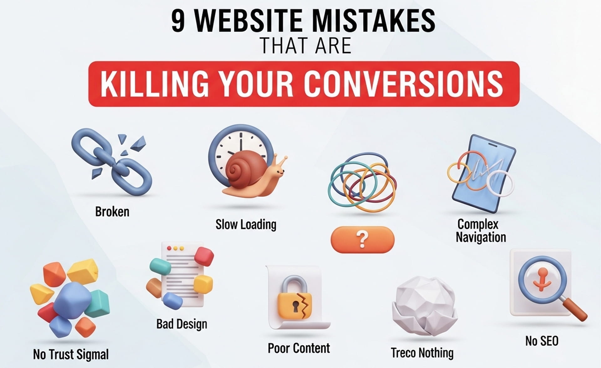
1. Slow Website Loading Speed That Kills Conversions
Website speed has a direct impact on conversion rates. Users expect pages to load fast, and anything beyond 2 to 3 seconds creates frustration. A slow site increases bounce rate, reduces engagement, and causes potential customers to leave before they even read your offer.
Impact:
- Higher bounce rate
- Lower engagement
- Lost conversions
Fix:
- Compress large images
- Use CDN and reliable hosting
- Improve Core Web Vitals
Speed optimization is one of the fastest ways to improve website conversion rates.
2. Weak Call-to-Action Examples That Reduce Conversions
If your CTA is vague, visitors will not know what to do next. Generic buttons like “Submit” or “Learn More” do not create urgency or communicate value. Strong calls to action clearly tell users what they get and why they should click.
Weak CTA examples:
- Submit
- Learn More
Better CTA examples:
- Get My Free Quote
- Book Service Now
Fix:
- Use benefit-driven CTA text
- Place CTAs above the fold
- Repeat CTAs strategically across the page
A strong CTA removes hesitation and increases action.
3. Poor Mobile Optimization for Conversions
Most website traffic now comes from mobile devices, and most conversion leaks happen there too. If your website is hard to read, difficult to navigate, or frustrating to use on mobile, you are losing a huge percentage of potential leads.
Common mobile issues:
- Small text that is hard to read
- Buttons that are difficult to tap
- Long forms that feel annoying on phones
Fix:
- Use mobile-first design
- Create thumb-friendly layouts
- Add click-to-call buttons
A bad mobile experience directly hurts your website conversion performance.
4. Cluttered Web Design That Reduces Conversions
A lot of businesses ruin their own websites by stuffing them with too many colors, fonts, animations, sections, and popups. They think flashy design looks impressive, but it usually creates confusion and kills conversions.
Problem:
- Too many colors, fonts, and animations
- No clear focus on the main action
- Overloaded sections competing for attention
Fix:
- Use a clean and simple layout
- Keep one main CTA per section
- Create strong visual hierarchy
Simplicity converts better than overdesigned nonsense.
5. No Trust Signals on Your Website
Users do not trust a business just because it has a website. If your site does not show proof, visitors hesitate. Missing trust signals make even a good offer feel risky.
Missing elements:
- Reviews
- Testimonials
- Case studies
- Real team or project photos
Fix:
- Add social proof across service pages
- Show real results and outcomes
- Place trust-building elements near CTAs
Trust reduces hesitation, and less hesitation means more conversions.
6. Confusing Navigation Structure
If users cannot quickly figure out where to go, they leave. Navigation should guide visitors, not make them think. Too many menu items, vague labels, and hidden important pages create friction that directly affects conversion rates.
Common mistakes:
- Too many menu items
- Confusing or vague labels
- Important pages buried or hard to find
Fix:
- Keep navigation simple with 5 to 7 core items
- Use clear labels like Services, Pricing, Contact
- Make the user journey obvious
Easy navigation improves usability and leads to better conversions.
7. Long Forms That Reduce Conversion Rates
Long forms are a conversion killer, especially on mobile. The more effort it takes to submit an inquiry, the more likely users are to abandon it. Most websites ask for too much information too early.
Why it fails:
- Feels like too much effort
- Creates privacy concerns
- Slows down decision-making
Fix:
- Ask only for essential details
- Use multi-step forms when needed
- Enable autofill wherever possible
Less friction means more completed forms and better lead generation.
8. Generic Messaging With No Personalization
Talking to everyone usually means converting no one. Generic website copy feels irrelevant because it does not connect with a specific audience, location, or intent. Relevance is what makes people feel like your service is for them.
Problem:
- Same message for all users
- No audience targeting
- No local or service-specific relevance
Fix:
- Use location-based messaging
- Adjust content based on search intent
- Customize CTAs for specific services
Relevant messaging improves trust, engagement, and conversions.
9. Weak Value Proposition Above the Fold
Your headline and top section decide whether users stay or leave. If your value proposition is vague, bland, or generic, visitors will not understand what you do or why they should care.
Weak example:
We Provide Quality Services
Strong example:
We Help Homeowners Get a Weed-Free Lawn Without Hassle
Fix:
- Be specific about what you offer
- Lead with the customer benefit
- Add a clear CTA in the hero section
Clarity above the fold is one of the biggest drivers of higher conversion rates.
Quick Checklist to Fix Conversion Rate Optimization Mistakes
If you want faster improvements, start here:
- Improve website speed
- Strengthen your CTAs
- Optimize the mobile experience
- Add reviews and trust signals
- Simplify your forms
These changes alone can significantly improve your website conversion rate without spending more on traffic.
FAQs: Website Mistakes & Conversion Optimization
1. Why is my website getting traffic but no conversions?
Because traffic means nothing if the website experience is broken. Slow loading speed, weak CTAs, poor mobile design, confusing navigation, or a lack of trust signals are common reasons users leave without converting.
2. What is the biggest website mistake that hurts conversions the most?
A weak or unclear value proposition is one of the biggest conversion killers. If users do not instantly understand what you offer and why it matters, they leave within seconds.
3. How can I improve my website conversion rate quickly?
Start with the basics: improve page speed, use stronger calls to action, simplify forms, make the site mobile-friendly, and add trust-building elements like reviews and testimonials.
4. Do website design elements really affect conversions?
Yes, heavily. Cluttered layouts, too many visual distractions, and poor hierarchy create friction. Clean, easy-to-scan design helps users focus and take action.
5. How important is mobile optimization for conversions?
It is critical. Most traffic comes from mobile devices, and if your website is not fast, readable, and easy to use on phones, you are losing leads every single day.
Why Choose Brandlino?
At Brandlino, we help businesses fix the website issues that quietly destroy leads and sales. Our team focuses on building conversion-driven websites that do more than just look good.
- Improve website conversion rates
- Create stronger messaging and CTAs
- Build fast, mobile-friendly pages
- Turn traffic into real leads and inquiries
Whether you need a redesign, landing page optimization, or a full conversion strategy, we build websites that are designed to perform.
Final Thoughts
Most websites do not have a traffic problem. They have a conversion problem. If your site is slow, cluttered, generic, or hard to use, it will keep losing potential customers no matter how much traffic you send to it.
Fix the fundamentals:
- Speed
- Clarity
- Strong CTAs
- Mobile usability
- Trust signals
Get those right, and your website stops being a brochure and starts becoming a conversion machine.
FAQ's
Common mistakes include slow loading speeds, confusing navigation, weak calls-to-action, poor mobile design, and unclear messaging. These issues can cause visitors to leave without taking action.
A fast-loading website improves user experience and keeps visitors engaged. Slow websites often have higher bounce rates and lower conversion rates.
A strong CTA tells visitors exactly what to do next, such as requesting a quote, booking a service, or contacting your business, which increases conversions.
Yes. A mobile-friendly website provides a better browsing experience, making it easier for users to navigate and complete actions on any device.
Improve page speed, simplify navigation, use clear CTAs, add customer testimonials, and regularly test and optimize your website based on user behavior.